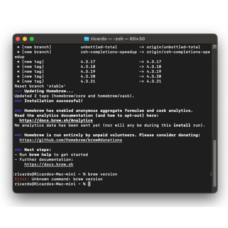
Here’s how it typically unfolds:
- You run the installation command:
/bin/bash -c "$(curl -fsSL https://raw.githubusercontent.com/Homebrew/install/HEAD/install.sh)"
- Confident that Homebrew is installed, you check the version:
brew version
But instead of seeing the version number, you’re told that the brew command does not exist.
So, what’s the issue here? The terminal actually prompts you to run a second command after the installation:
(echo; echo 'eval "$(/opt/homebrew/bin/brew shellenv)"') >> /Users/ricardo/.zprofile
eval "$(/opt/homebrew/bin/brew shellenv)"
However, because this prompt is in the same white and black color scheme as the rest of the terminal text, it’s easy to overlook. The visual similarity makes it hard to differentiate between critical instructions and the general output, leading many to miss this crucial step.
The Missing UX Principle: Visual Hierarchy
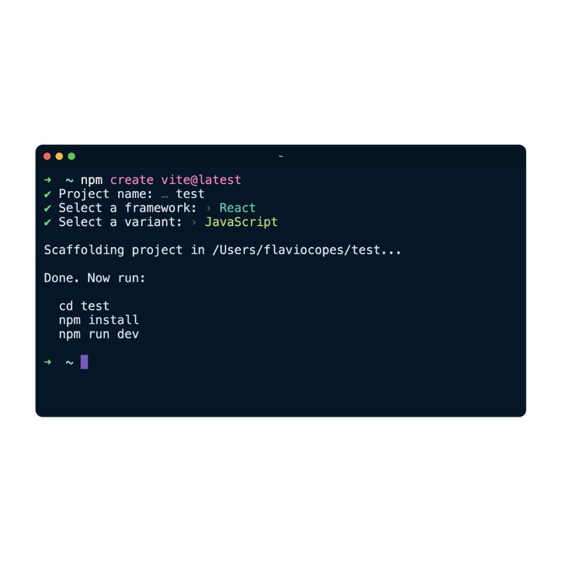
This oversight is a prime example of where the UX principle of visual hierarchy is lacking. Visual hierarchy refers to the arrangement or presentation of elements in a way that implies importance. In this case, if the terminal had visually emphasized the need to run the second command—perhaps with color differentiation or bold text—users would be more likely to notice and follow through.


The lesson here? Pay close attention to all instructions, and remember that sometimes, a little UX refinement could save a lot of user frustration.
The organization of information in a clear hierarchy is the key to making the complex appear simple. — Richard Saul Wurman


