


In the realm of user experience, optimizing the way users interact with digital interfaces is important, and one effective approach to achieve this is by minimizing cognitive load.
Users enter your website or application with preconceived notions of how similar platforms function, thanks to their past experiences on other sites. By incorporating familiar labels and layouts that they have encountered before, you can tap into their existing mental models. This approach reduces the cognitive effort required to navigate your interface and empowers users to quickly and intuitively understand how to interact with your product. Building on these established patterns helps create a sense of familiarity and instills confidence in users, ultimately leading to a more enjoyable experience.
Simplify the Learning Curve
When users encounter a new interface, they naturally expect a certain level of familiarity and consistency. By adopting well-known labels and layouts, you can minimize the learning curve they face. When elements and interactions feel familiar, users can focus their attention on achieving their goals rather than spending excessive mental energy on figuring out how to navigate your site. This approach increases efficiency and user satisfaction, as they can quickly adapt to your interface and complete tasks easily.
Example of a higher cognitive load
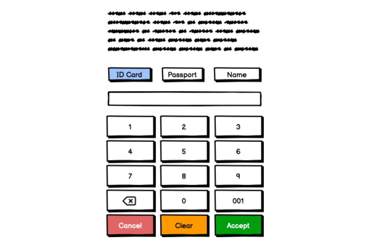
The next example is of a ticket machine, which requires you to input your identification in order to give you a numbered ticket but it suffers from a few shortcomings.
Old Interface
 Fair use of a higher congnitive load interface
-
There is no visual indication of which button is active so you dont know what option is selected. When a button or a tab is active but lacks a clear visual indicator, it can lead to confusion or make it harder for users to distinguish the active element from the inactive ones. Designers generally strive to provide high affordance to elements like buttons or tabs, ensuring that users can easily identify the active state and interact with the interface effectively. This can be achieved through various visual cues, such as color changes, underlines, bold text, or other indicators to highlight the active tab or button.
-
When you click another option button, the data you input is erased, and this is specially terrible because in Ecuador you SSN is the same number as your passport and is (altmost always) your VAT numer with 001 at the end. This is generally considered a poor user experience because it can lead to frustration and inefficiency. Users expect their input to be retained unless they deliberately delete or clear it themselves. When input is unexpectedly lost, it can result in errors, especially if the user moves away from the text box accidentally or due to a misjudgment.
-
The button size for the numbers is too small. The size of interactive elements, such as buttons, is a crucial aspect of user experience, especially on touch-screen devices. When buttons are too small, users might have trouble accurately tapping them, leading to frustrating experiences and potential errors, specially if you are feeling ill need to input information to receive medical atention.
-
The buttons are in a weird position, buttons should be logically placed and have a Visual Hierarchy. Designing buttons in UX to align with the user flow is crucial for creating a seamless and intuitive user experience.
New Interface
 Example of a new interface
In User Experience design, when a tab is active but there is no color or any other visual indicator to show its active state, it is often referred to as having “low affordance” or “low visibility” for the active state.
Affordance is a term used in UX design to describe the perceived action or functionality of an element within an interface. High affordance means that the purpose or state of an element is clear and easily understood by users. In contrast, low affordance means that the purpose or state of an element is not immediately evident, and users might have difficulty identifying its active or interactive state.
In User Experience, where input in a text box is erased when you click on something else, is commonly referred to as “unintended data loss” or “input loss on focus change.”
To avoid unintended data loss, UX designers often implement solutions such as auto-saving user input or showing a confirmation prompt if the user tries to navigate away without submitting the form or saving their data. These measures help prevent accidental loss of data and improve the overall user experience.
Position buttons where users naturally expect to find them based on the flow of the task. Primary actions should typically be more prominent and placed in a position that is easy to reach and see. Secondary or less important actions can be placed as appropriate.
Design buttons with varying visual emphasis to convey their importance. The primary action should stand out more compared to secondary or tertiary actions. This can be achieved through size, color, or styling.
When buttons are too small and difficult to interact with, it is often referred to as “button size usability issue” or “small touch target problem.”
Conclusion
Leveraging UX mental models is a powerful strategy in User Experience (UX) design that aligns the digital interface with users’ existing knowledge and expectations. Mental models are cognitive representations of how users perceive and understand the world, including how they approach tasks and interactions. By tapping into these mental models, UX designers can create interfaces that feel intuitive, familiar, and comfortable, leading to improved usability and user satisfaction.
When affordances are taken advantage of, the user knows what to do just by looking: no picture, label, or instruction needed. - Don Norman, Grand Old Man of User Experience


