


Introduction
In today’s digital age, understanding user behavior is paramount to the success of any website. Every click, scroll, and interaction tells a story about your users’ needs and preferences. Without these insights, you’re essentially navigating your site’s design and functionality in the dark.
Enter Microsoft Clarity, a free analytics tool designed to illuminate how users interact with your website. It has features like heatmaps, session recordings, and an insights dashboard, Clarity offers tools help identify pain points, optimize content placement, and ultimately, enhance overall user satisfaction.
What is Microsoft Clarity?
Microsoft Clarity is a robust, free analytics tool that provides website owners with detailed insights into user behavior. It helps you understand how visitors interact with your site by visualizing user actions and identifying areas for improvement. With its user-friendly interface and comprehensive data collection, Clarity is an essential tool for enhancing user experience (UX) and optimizing website performance.
Microsoft Clarity offers several powerful features designed to give you a deeper understanding of your users’ interactions:
-
Heatmaps: Clarity’s heatmaps visually represent where users click, scroll, and hover on your site. This feature helps identify which parts of your pages attract the most attention and which areas may need adjustment to improve engagement.
-
Session Recordings: With session recordings, you can watch real user sessions as they navigate through your website. This feature provides valuable insights into user behavior, allowing you to see firsthand where users encounter issues or drop off.
-
Insights Dashboard: The insights dashboard aggregates data and presents it in an easy-to-understand format. It highlights key metrics such as user engagement, popular pages, and user paths, enabling you to make informed decisions to enhance your website’s UX.
Key Features of Microsoft Clarity
Heatmaps:
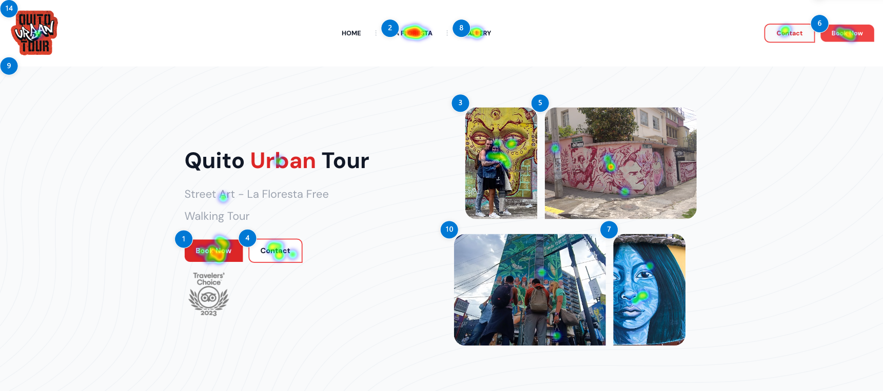 Quito Urban Tour Heatmap
Heatmaps are visual representations that show where users click, scroll, and hover on your website. By using color gradients, heatmaps highlight areas of high and low interaction, with warmer colors (like red and orange) indicating higher levels of activity and cooler colors (like blue and green) indicating less interaction. This visual tool helps you understand which parts of your web pages attract the most attention and which areas might be overlooked by your visitors.
The primary benefit of using heatmaps is gaining a clear, intuitive understanding of user behavior on your site. With this information, you can:
-
Identify Popular Elements: See which buttons, links, or images are most frequently interacted with, helping you understand what draws users’ attention.
-
Optimize Layout and Design: Discover which parts of your page are not engaging users, allowing you to redesign or reposition elements to improve usability and engagement.
-
Enhance Conversion Rates: By focusing on high-interaction areas and ensuring critical call-to-action (CTA) elements are placed there, you can improve conversion rates and achieve better business outcomes.
Here are a few examples of how heatmaps can highlight areas of improvement:
- Identifying Unnoticed CTAs: Suppose you have a call-to-action button at the bottom of a page, but the heatmap shows that most users are not scrolling down that far. You can move the CTA higher up to increase visibility and engagement.
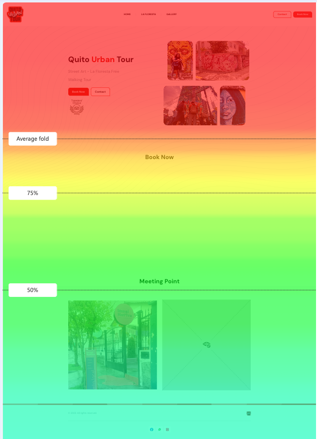 Quito Urban Tour Scrollmap
-
Improving Navigation: If a heatmap reveals that users frequently click on a non-interactive element, you might consider making that element clickable or providing clearer navigation cues.
-
Content Placement: If users are not interacting with important content, you can use heatmap data to reposition it where users are more likely to engage, such as closer to the top of the page or within high-traffic areas.
By leveraging the insights provided by heatmaps, you can make informed decisions to optimize your website’s layout, improve user engagement, and enhance the overall user experience.
Session Recordings:
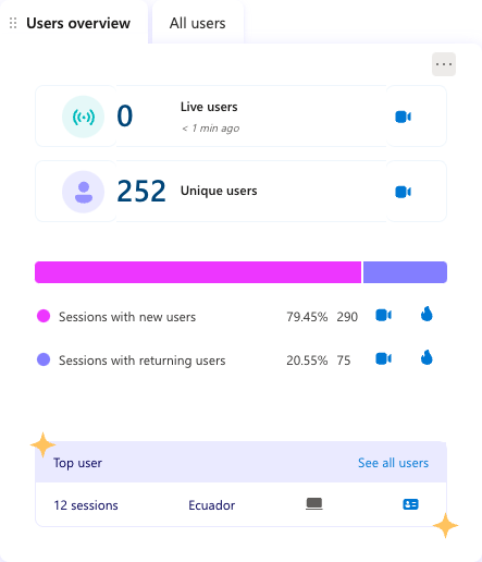
 Quito Urban Tour Sesion recording example
Session recordings are a feature of Microsoft Clarity that allows you to capture and playback individual user sessions on your website. These recordings provide a real-time view of how users navigate through your site, including mouse movements, clicks, scrolling behavior, and interactions with various elements. This tool lets you observe the user’s journey as if you were watching over their shoulder, giving you detailed insights into their experience.
Session recordings offer several significant benefits for understanding and improving user experience:
-
Real User Insights: By observing actual user sessions, you can see exactly how users interact with your website, revealing patterns and behaviors that might not be apparent through traditional analytics.
-
Identify Pain Points: Recordings can highlight areas where users struggle, such as confusing navigation, non-responsive elements, or barriers to completing desired actions. This helps you pinpoint specific issues that need attention.
-
Improve User Flow: Understanding how users move through your site allows you to optimize the user flow, making it easier for visitors to find information and complete tasks, ultimately enhancing their overall experience.
-
Validate Design Decisions: Session recordings can confirm whether design changes or new features are having the intended effect, providing a direct line of feedback from your users.
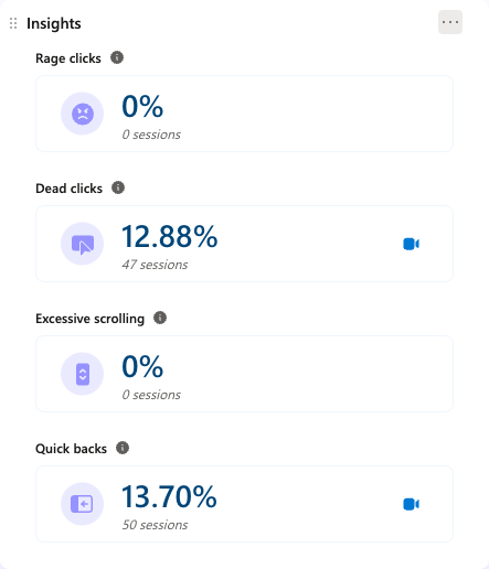
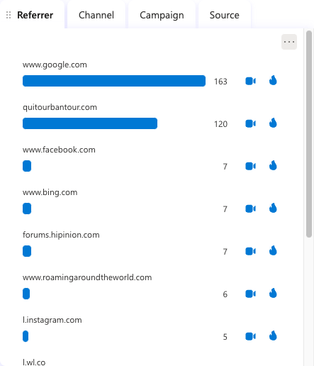
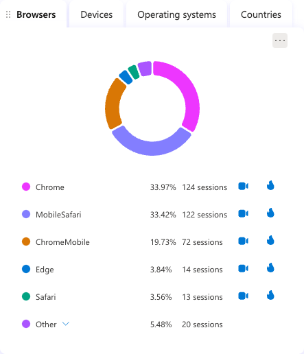
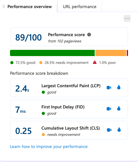
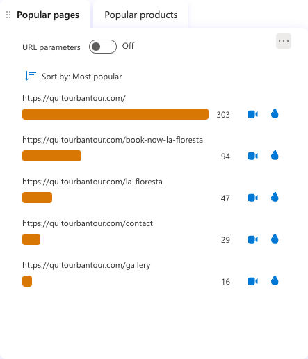
Insights Dashboard:
The insights dashboard in Microsoft Clarity is a powerful feature that aggregates and visualizes your website’s data in an easy-to-understand format. This centralized hub provides a comprehensive overview of key metrics, helping you quickly identify trends and patterns in user behavior. The dashboard is designed to highlight the most critical data points, making it easier for you to make informed decisions to enhance your website’s user experience (UX).
Conclusion
Microsoft Clarity is a powerful tool that offers invaluable insights into how users interact with your website. By leveraging its heatmaps, session recordings, and insights dashboard, you can make informed, data-driven decisions to enhance your site’s UX. Whether you’re a UX designer, web developer, or business owner, integrating Clarity into your workflow can lead to significant improvements in user satisfaction and overall website performance.
I encourage you to try Microsoft Clarity for yourself and experience its benefits firsthand. It’s a free tool that can provide you with deep insights into user behavior and help you optimize your website. If you’ve already used Microsoft Clarity, I’d love to hear about your experiences. Please share your thoughts, insights, or questions in the comments below!


