Introduction
In the digital world, the way we communicate with users can make or break their experience. UX writing is the art of crafting the words that guide users through interfaces, making interactions seamless and intuitive. Good UX writing is not just about being clear and concise—it’s about understanding user needs and addressing them effectively. Let’s dive into some real-world examples to see how powerful UX writing can transform user experiences.
Wyze Email Notifications
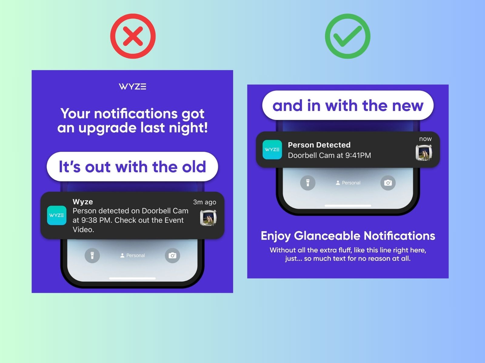
Wyze, known for its smart home devices, used to send out email notifications that were lengthy and complicated. Users often found it hard to quickly understand what the alert was about and whether it required immediate attention.
Original Problem: The notification contained a long paragraph of text describing the alert, making it difficult for users to quickly grasp the message.
Solution: Wyze revamped their email notifications by significantly reducing the text and adding thumbnail images. Each alert now briefly states what happened and where, complemented by a relevant thumbnail.
 Wyze UX Writing Fair Usage
Benefits: This change allows users to quickly and easily assess the incoming alert. They can see at a glance what the issue is and decide on their next action without sifting through lengthy text. This enhancement has made the notifications more user-friendly and efficient.
Odoo Messaging Buttons
Odoo is a popular business management software with a range of features, including messaging. However, there was a significant UX issue with the buttons for sending messages and internal notes in version 15.
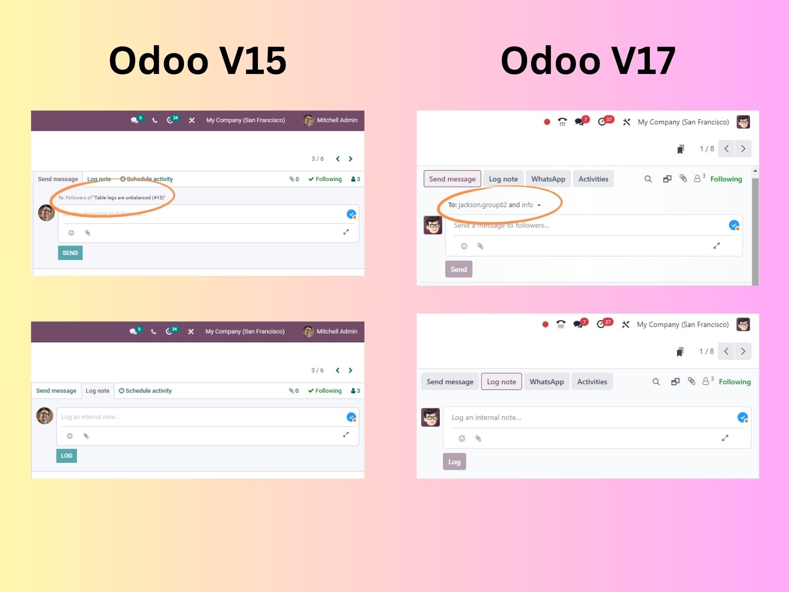
Problem in Version 15: In Odoo v15, users have two options: send an email message to everyone or post an internal note. The buttons for these actions are labeled “Send” and “Register,” respectively, and they are the same color, size, and almost the same length. This lack of differentiation often leads to confusion, even among experienced users. Additionally, the “Send” button merely stated it would send the message to followers of the document, which was not always clear enough.
Improvement in Version 17: In Odoo v17, this issue has been addressed. Now, when users click “Send,” the interface shows the contacts the message will be sent to, providing a clear visual cue of the action’s impact. This change helps users understand exactly who will receive the message, reducing confusion and preventing mistakes.
Impact: These improvements significantly enhance the user experience by providing clear differentiation between actions and better visual cues, making it easier for users to understand and execute their desired actions.
 Odoo UX Writing Fair Usage
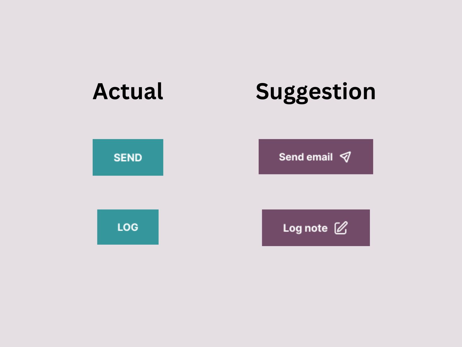
Suggestions for Further Improvement: While the updates in v17 are a significant step forward, continued emphasis on clear labeling and color differentiation can further enhance usability. Descriptive labels like “Send Message” and “Post Note” can provide additional clarity.
 Suggestions
Conclusion
Effective UX writing is essential for creating digital interfaces that are intuitive and user-friendly. The examples from Wyze and Odoo illustrate how thoughtful UX writing can significantly enhance user experience. By adopting clear and concise language, differentiating actions, and providing easy-to-understand messages, designers can improve usability and satisfaction.
As you design your next product, remember the power of words. Good UX writing is not just about what you say but how you say it. Keep it simple, keep it clear, and always keep the user in mind.


