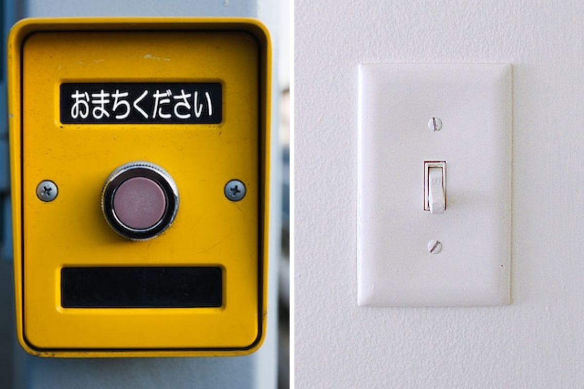
Feedback is King
Feedback is an integral aspect of effective design, as it serves as the means through which a device communicates with its user. Successful design not only resolves user queries and eliminates confusion but also necessitates clear communication with users through signs, sounds, and vibrations to facilitate their interaction with the device.
if the system encounters a problem or the user makes an error, the device should promptly notify the user with an error message and provide guidance on resolving the issue. Feedback also plays a vital role in informing users about the product’s real-time status, such as whether a component is active or inactive.
Take the instance of a home security system that is activated before leaving the house; if a break-in occurs, the system alerts the police. When configuring the alarm, the system should emit a signal indicating its activation status. Without this feedback, users might inadvertently leave their homes unprotected or trigger their own alarms by mistake.
When Technology Outpaces Design
The incredibly rapid development of technology can make it difficult to keep up with the latest trends and features. This can lead to designers focusing on the technology instead of the user, and can result in products that are difficult to use and understand.
A watch that is designed with a lot of features, but the user interface is not well-designed, can be difficult to use and understand.
A watch that is designed with a lot of features, but the user interface is not well-designed, can be difficult to use and understand. • A watch that is designed with a lot of features, but the user interface is not well-designed, can be difficult to use and understand.
 The evolution of the Watch
To avoid bad design, it is important for UX designers to focus on the user first and foremost. This means taking the time to understand the user’s needs and wants, and designing a product that is easy to use and understand. It also means testing the product with users before launching it, to get feedback and make sure it is meeting their needs.
Affordances & Signifiers
Affordances and signifiers are two important concepts in UX design.
Affordance is the perceived possibility of action of an object. It is what the object seems to be able to do. For example, a door affords pushing or pulling. A button affords clicking.
“When affordances are taken advantage of, the user knows what to do just by looking: no picture, label, or instruction needed.” — Don Norman, Grand Old Man of User Experience
 Affordances
Signifier is a visual cue that helps users understand the affordances of an object. It is what tells the user what they can do with the object. For example, a doorknob is a signifier for pushing or pulling a door. A label on a button is a signifier for clicking the button.
“Good design requires, among other things, good communication of the purpose, structure, and operation of the device to the people who use it. That is the role of the signifier.” — Don Norman, “Grand Old Man of User Experience”
 Signifiers
The Design of Everyday Things is a must-read for anyone who is interested in user-centered design. It is a valuable resource for designers, engineers, and anyone who wants to create products that are easy to use and understand.


